Let’s talk about global warming, starting by looking at the last 500 million years of the planets temperature below.
https://earth.org/data_visualization/a-brief-history-of-co2/
The truth is that our
planets temperature is slowly decreasing as the molten magma core temperature
cools.
The magma core has stabilized the temperature of the earth throughout history. As the core temperature decreases, it provides less of a stabilizing effect, leading to wider temperature swings, or cycles with lower lows, and higher highs. These cycles are shown below on a NASA site where you can see that we are nearing the peak of a normal cycle that has been happening about every 100,000 years, for the past 400,000 years. It is worth noting below that earth’s Temperature (in RED) appears to decline before CO2 does suggesting that a lower temperature (cause?) reduces CO2 (effect); not the other way around.
Do you believe NASA? We are currently about 40,000 years past due for another spike in temperature.
https://earthobservatory.nasa.gov/ContentFeature/CarbonCycle/images/epica_CO2_temperature.png
Granted CO2 has increased as shown by "scary" graphs like below, that have ZOOMED in scales (Y Axis) to make it look much worse, like looking at it under a microscope.
So we must look carefully at the scale on this graph to put it in
perspective, as the "scary" increase in CO2 can only be seen under a microscope (figuratively speaking).
Look at the 300 PPM (parts per million) 1950 line. This means that our air contained 300/1,000,000 of CO2, or 0.0003 portion, i.e. a very small fraction, or 1/300,000th of our Air is CO2. This has clearly increased since industrialization, something that has never happened before in world history, by 0.0001 or 1/830,000th. In other words, a very small increase relative to what it represents within our total air composition, i.e. the big picture.
NOW lets look at the "scary" spike in CO2 at FULL scale as opposed to under a microscope.
See the RED line at the very bottom of the graph above? Notice the "scary" spike today over the past 800,000 years? It is SO small at FULL scale that it can barely be seen, if seen at all.
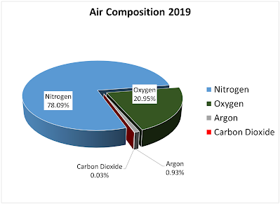
I think the graph below puts it in perspective best. The CO2 portion of the atmosphere is set to display in RED, so that it would stand out. Unfortunately it is such a small & insignificant portion, that the graph shows almost nothing but a paper thin slice.
The UK has done well reducing emissions, but their high cost of production has driven European manufacturing and resulting CO2 generation to China.
http://sustainabilitymath.org/wp-content/uploads/2018/12/annual-share-of-co2-emissions.png
The US has likewise done well in reducing CO2 Emissions. China, on the other hand, who is exempt from the Paris Accord, is increasing significantly.
https://news.climate.columbia.edu/wp-content/uploads/2015/12/US-emissions-chart.jpg
When we compare the US CO2 production to small countries with small populations, it looks much worse than it really is.

The US, as a prosperous country, with one of the most luxurious life styles, also produces the most CO2 on a per person basis. But is that really bad? What absorbs CO2?
Does this mean we don't need to improve? NO, it just puts the issue in perspective.... the sky is not falling.... the end of the world is not near.... at least not from climate change. Nuclear war (and power) is perhaps the greatest risk to man kind. We DO need to plant more trees, as our planet is being deforested at an alarming rate. Single use paper bags vs plastic generates 4X more C02 and kills trees at a much faster rate.
The Carbon Credit system being proposed, is a wealth re-distribution scheme. Poor countries that don't produce CO2 would earn carbon credits, that rich CO2 producing countries must buy. Even Americans on Welfare live in the top 2% of the world, and the rest of the world wants their share, which would come at our expense. Imagine giving up 90% of what we have.
Why do we have so much? Our US Constitution is the answer. Read it.
If you learn one thing from this, it is don't believe the Foreign controlled main stream media, especially those that censor facts & political opinions, like Facebook and Google.
Other good NASA links are below.
https://earthobservatory.nasa.gov/images/87146/a-year-in-the-life-of-carbon-dioxide


